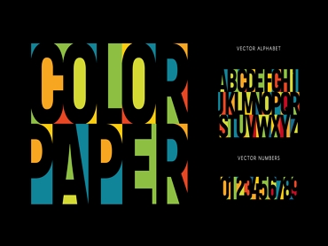
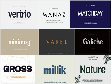
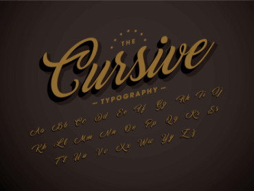
What do you think the font is? If you think fonts are just different shapes of letters designed for aesthetics, you are wrong. Sometimes, the right font can make a classic logo, and the wrong font can ruin a brand image and cause sales to decline.
In the process of communication, people will inevitably introduce words to express their emotions, and the same is true in logo design. The text in a logo design plays an explanatory and decorative role. The font is mainly through the comprehensive layout and design arrangement of the text to achieve the prominence of the graphic design content. The trend of "patterning" of text can not only improve the communication effect but also enhance the artistry of design to a whole new level.
So among the countless fonts, which one should you choose? Don't worry, choosing the right font can take some time, read this article to see which are the most popular.
1. Bodoni
Bodoni is the name of a serif typeface first designed by Giambattista Bodoni in the late 18th century and has since been revived as a popular typeface several times. Bodoni's fonts are classified as Didone or Modern.
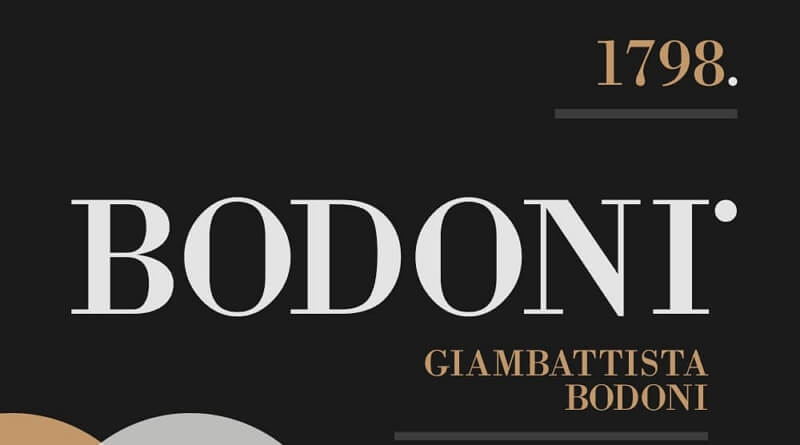
Fashion magazine covers should be the most stylish, beautiful, elegant, and upscale. And the title in it is like the eyes on the face, and it is the key to determining all the images. The two most representative fashion magazines - "VOGUE" and "HAPPERS BAZAR", the most preferred font is Bodoni. Because it can be impressive with loose line spacing, it can convey style, elegance, and sophistication.
2. Garamond
What can make any bland sentence capable and noble? That's the font. When writing with Garamon, even sentences like "Let's play!" and "I AM TOM." can be made into very noble.
Garamond is a general term for a type of Western serif font, and it is also the representative font of the old serif. The name comes from a French typecaster, Claude Garamond. Most of the typefaces later named Garamond came from another typecaster, Jean Jannon. The direct relationship between Garamond and current fonts can be seen in the serif typefaces of Sabon, Granjon, and Adobe Garamond.
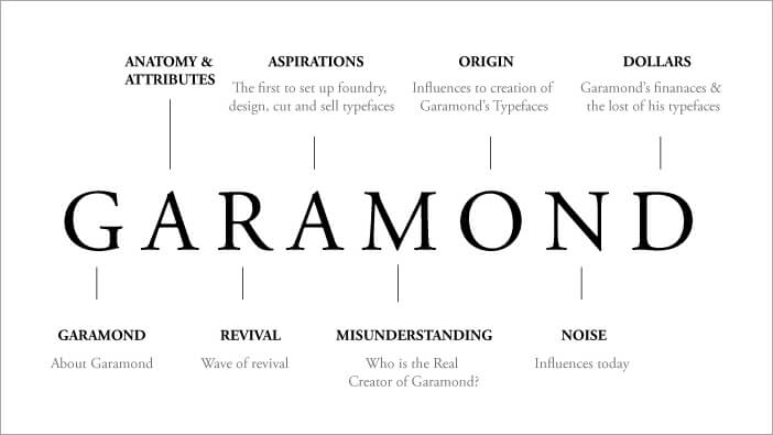
Garamond's typeface has fluidity and consistency, and its most characteristic features are the small hook for the lowercase a and the hole for the letter e. Tall letters and top serifs have long bevels. There are many versions of Garamond, of which Adobe Garamond produced by Adobe is the most widely circulated and considered to be one of the best electronic versions of Garamond. Using Egenolff Berner's sample as a model, and extensive research was done at the Palatine Museum, Robert Slimbach eventually produced Adobe Garamond.
3. Helvetica Now
There is a font, which can be called the legend of the fonts, which has withstood the test of time and space and surrounded your life without knowing it. It is the famous Helvetica. "If you don't know what font to use, use Helvetica." This sentence, which is widely spread in the graphic design industry, seems to be a joke, but it also fully reflects the status and wide applicability of Helvetica in society.
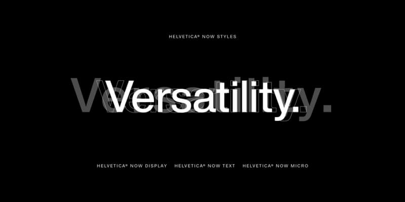
The type designer redesign the classics, solved the common challenges of contemporary brand marketing while retaining Helvetica's simple and clear concept and global charm, resulting in Helvetica Now. This font is larger, more expressive, and has given designers more space. These characteristics are also the reasons why it is so popular and enduring.
4. Choplin
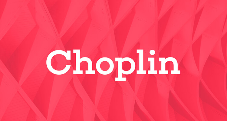
Choplin is a clear and modern geometric slab serif that has always been designed with geometry, simplicity, and neutrality in mind. It was designed by German designer Rene Bieder, inspired by Gill Sans and Johnston Sans. It is considered the top logo font for confident brands and is used in everything from photographic layouts to editorial and confident headlines.
This logo font is best suited for contemporary and narrative magazines and journals.
5. FF Avance
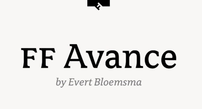
FF Avance is a special font that pushes the envelope on asymmetrical serifs. The lower serif of an uppercase "A" points to the right, while the upper serif of a lowercase "v" points to the left.
If you want to depict movement and energy, consider this logo font. It's a great choice for the sports, automotive, and action industries.
6. Futura
Futura - Paul Renner's most enduring work - is the most recognizable of all German typefaces. Commissioned in 1924, it belongs to an era of pre-Nazis that still looks modern despite more than eighty years. It's a typeface that has fans of typefaces excited: witness the controversies surrounding IKEA's ditching of it for Verdana.
Futura was originally developed for publisher Jakob Hegner, who told Renner that he wanted something artistically liberating. On the second day of the meeting, Renner was working on the first draft, and the sample sentence he chose to experiment with the new typeface was: "die Schrift unserer Zeit", he wrote: "The typeface of our time".
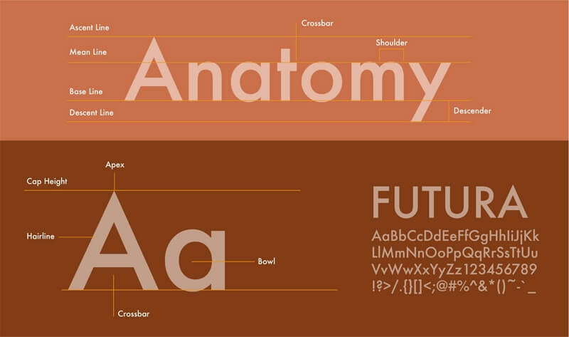
Volkswagen, with its socialist market ideals, still uses Futura in its advertisements, and now changing the font would be dangerous, like fiddling with the brakes. Not only did the Apollo 11 astronauts collect the rock and plant a flag, but they also left a nameplate carved in Futura capital letters. Did the short-sleeve folks in Houston simply choose Futura for typographic reasons, or was the name just right for the task? Who knows. It looked right in the end anyway.
7. Panton Rust
Panton rust is an old-fashioned font that includes handwriting and sans serifs. Inspired by the touch of classic retro, and the design culture of women, this font will be the perfect font for poster design. It features font inlining, shadows, and textures that can be combined for a variety of color effects.

8. Cassannet
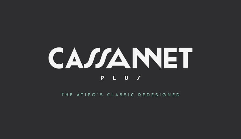
Cassannet is a font based on the font on Cassandre's poster. Sans serif typefaces are perfect for retro typography lovers, Cassandre lovers, and Art Deco connoisseurs. Cassandre, also known as Adolphe Mouron, a Ukrainian born and raised in Paris, was one of the most popular poster designers of the 20th century. His work celebrates modern luxury transportation and a prosperous way of life.
9. Baltica
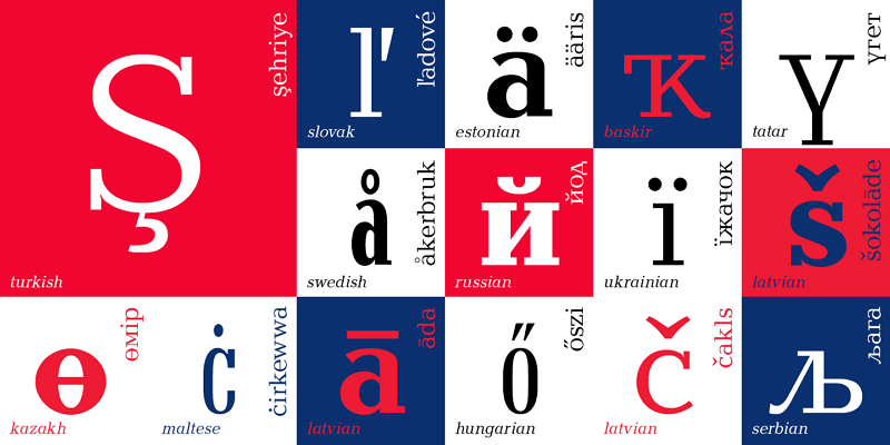
Baltica was created in 1998 by Russian designers Paratype/Vera Chiminova, Isay Slutsker. While Baltica meets the criteria for a thick serif, it looks very similar to a simple sans serif. Thick stubs are shrunk and are not the same width as glyphs, which is unusual for thick serifs. These characteristics ultimately set Baltica apart, and the unique typeface shape has helped redefine brands like Winston.
Consider this font for those who want to be seen as a trusted classic, or for brands that embrace traditional values.
10. Caslon
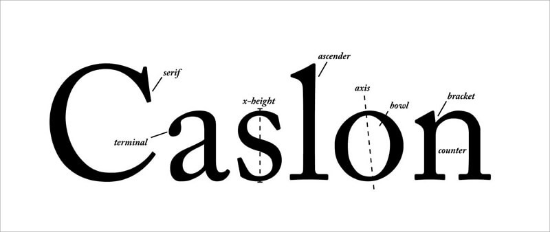
Caslon fonts are characterized by short ascenders and descenders, equal trim, strong and moderate black and white contrast, and soft stroke thickness variations. At the top of the letter A, there is a shallow concave at the intersection of the two strokes, and the last stroke of the letter G's inward horizontal hook is omitted. Caslon Italic has a calligraphic stroke rhythm, and the letters A, V, and W have strong slanted lines.
Also Read: How Much Does it Cost to Design a Logo?
What's More You Should Know about Design?
1. What're the 7 Principles of Design?
- Balance
- Rhythm
- Pattern
- Emphasis
- Contrast
- Unity
- Movement
2. How Many Types of Logo Fonts are There?
- Serif logo fonts
- Sans serif logo fonts
- Script or cursive logo fonts
- Display logo fonts
3. How Can I Design My Own Logo?
In addition to specialized design studios that can design logos for individuals, you can also experiment with logo maker software to create logos, and there are already many options on the market.
However, the difficulty of designing a logo is not how to design it, but making clear what you want before you start designing. It is recommended to follow the following principles to sort out your design ideas:
- Know your brand personality
- Pick the fonts carefully
- Analyze your competition
- Choose the colors wisely
- Keep it simple
- Decide on a type of logo
Design Perfect Logos with EaseUS Logo Maker
Start Logo Design
